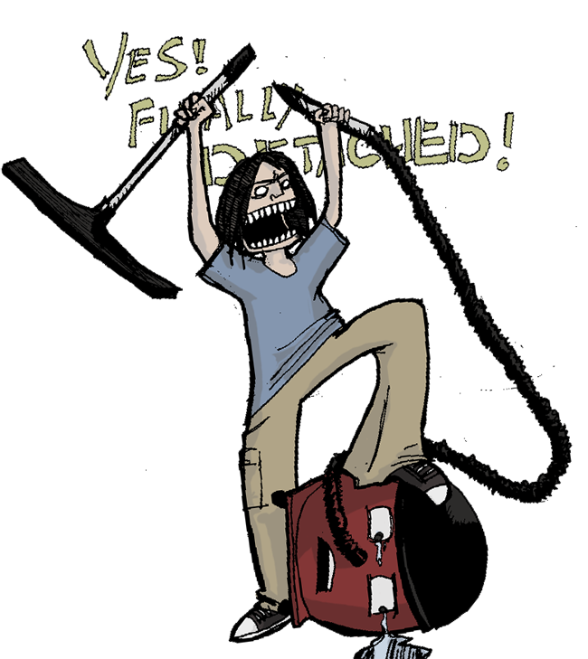
Despite the positive response I didn't really like the original version of this so I redrew it. I think it's a better drawing, except for Henry. He doesn't look round...he looks fat.
Thanks for all the nice comments. I'm glad you all agree with me that this one's better.
@ Chuck, I currently use a nondescript black marker pen my nearby art shop sells in massive volume for cheap, which I use for outlines. I also use a fineliner for details (it's Pilot branded)


10 comments:
Lol - I had a moment exactly like that the other day...
You're right, this is a better drawing, but I still like the ferocity of the your original!
nice drawing
i like your style
This has a nice sketchy energy to it
Looking great Sam, what pens are you using now days?
Yes, much better :-)
Thanks for all the nice comments. I'm glad you all agree with me that this one's better.
@ Chuck, I currently use a nondescript black marker pen my nearby art shop sells in massive volume for cheap, which I use for outlines. I also use a fineliner for details (it's Pilot branded)
Ah just like me then.
I also just bought a set of brush pens, it's very exciting.
Love your drawing style; the image made me laugh, having spent too much time with the vacuum cleaner this week (kitchen being redone).
Really like the new version. Real energy.
Post a Comment